GENEVA, Switzerland, June 21, 2021 (ENS) – Broadcast meteorologists and climate scientists are uniting today – the Summer/Winter Solstice – for “Show Your Stripes” day to raise awareness of the urgent need to act on climate change. The most dramatic change is in the Arctic, which is warming more than twice as fast as the global average.
UN Climate Change, the World Meteorological Organization, and the Intergovernmental Panel on Climate Change are backing the campaign, which is designed to build momentum for a strong outcome of the UN Climate Change Conference COP26 in Glasgow in November.
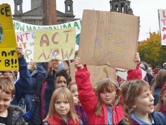
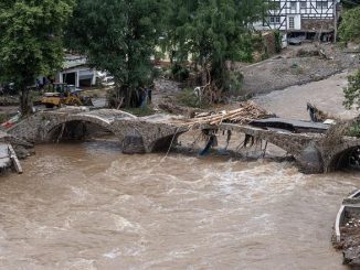
The climate scientists say 2021 is a make-or-break year for climate action, with the window to prevent the worst impacts of climate change closing rapidly, resulting in more frequent, more intense droughts, floods, storms, glacial melt and sea-level rise, and species extinctions.
“Weather presenters make excellent climate communicators. You play a major role in educating the public about the risks of climate change and extreme weather,” WMO Secretary-General Professor Petteri Taalas told a workshop of weather presenters organized by the International Weather and Climate Forum.
“The WMO State of the Climate report showed that 2020 was one of the three warmest years on record. It capped the warmest decade on record. The average global temperature was 1.2°C above the pre-industrial levels and glaciers continued to retreat, with long-term impacts on sea level rise and water security,” said Taalas.
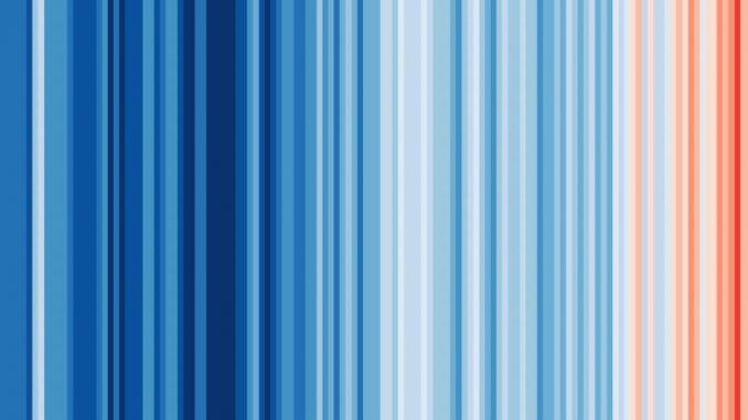
The Warming Stripes campaign is inspired by data visualizations from Professor Ed Hawkins, a climate scientist at the University of Reading in the United Kingdom and a lead author of the Intergovernmental Panel on Climate Change’s Sixth Assessment Report.
Hawkins has spearheaded the creation of “warming stripes” graphics, which are visual representations of the change in temperature as measured in each country over at least the past 100 years. Each stripe represents the temperature in that country averaged over a year and is based on internationally recognized datasets.
“The Warming Stripes are a simple and compelling way to visualise that the world is warming and that every country is warming. The graphics can help start local conversations about the increasing risks from climate change wherever you live, and the necessary actions to avoid the worst consequences,” comments Hawkins.
For virtually every country or region, the stripes have turned from mainly blue to mainly red in more recent years, illustrating the rise in average temperatures in that country.
The Warming Stripes campaign is run in conjunction with Climate Central, an independent organization of scientists and journalists based in Princeton, New Jersey, who research and report the facts about Earth’s changing climate and its impact on the public.
Climate Central is chaired by Dr. Stephen Pacala, a professor of ecology and evolutionary biology at Princeton University and director of the Princeton Environmental Institute. He also directs the Carbon Mitigation Initiative, a collaboration between Princeton University and the oil company BP to find solutions to the problem of global warming. His research focuses on interactions between greenhouse gases, climate and the biosphere.
Dr. Pacala is at the forefront of U.S. climate science. On February 2, the National Academies of Sciences, Engineering, and Medicine published the report, “Accelerating Decarbonization of the U.S. Energy System,” a technical blueprint and policy manual for decarbonizing the American economy. Dr. Pacala chaired the nationwide committee of experts who wrote the report.
In a public briefing, Pacala said the National Academies’ report is unique for its focus on creating a “fair and equitable path to net-zero by 2050.”
“What distinguishes this report is its focus on societal factors,” said Pacala. “At least half of what we recommend are targeting the social dimensions of this challenge.”
“The social dimensions are absolutely essential,” Pacala said. “At the end of the day, we have to maintain public support for a transition of the entire energy sector through three decades, and that means we’re really going to have to pay attention to people and ensure a fair distribution of both costs and benefits.”
The Warming Stripes campaign is supported by TV weather presenters and meteorologists who will be displaying the warming stripes on their broadcasts and social media posts.
Weather presenters and the general public are invited to participate in the campaign by downloading the graphic from their region or country and posting it on social media using the hashtags #ShowYourStripes and #COP26.
For example, you can update your social accounts to #ShowYourStripes with ready-to-use graphics including a Facebook frame for your profile image, a Facebook camera filter, cover photos for Twitter, Facebook, and LinkedIn.
Featured image: Warming Stripes for the entire planet Earth from 1850-2020. Graphics and lead scientist: Ed Hawkins Data: Berkeley Earth, NOAA, UK Met Office, MeteoSwiss, DWD, SMHI, UoR, Meteo France & ZAMG (Image courtesy Show Your Stripes)
© 2021, Environment News Service. All rights reserved. Content may be quoted only with proper attribution and a direct link to the original article. Full reproduction is prohibited.